Rebranding: Hotel Vilar América
Challenge:
To be able to communicate the Hotel's change and evolution, without hindering brand awareness and recognition.
Concept:
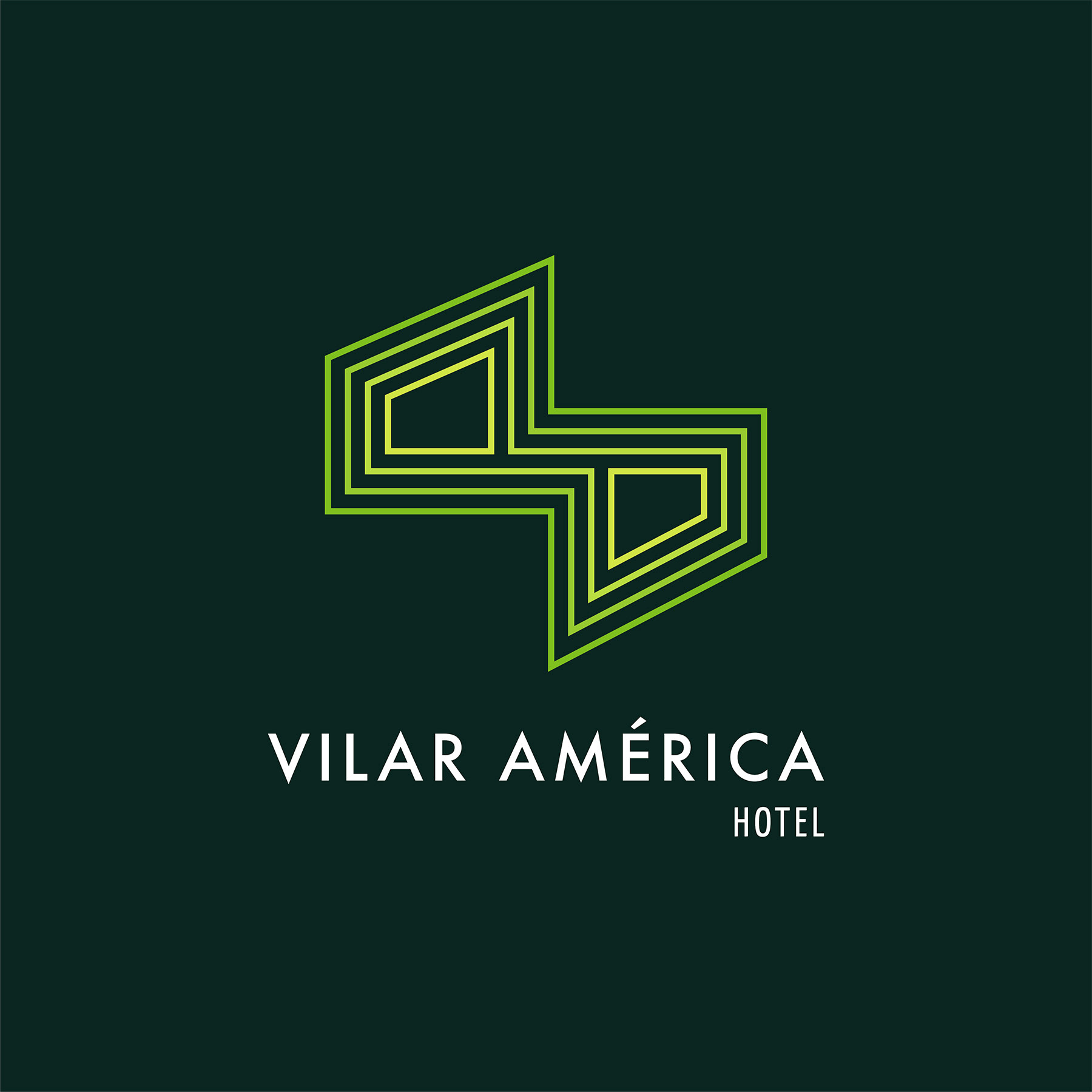
We sought out to find graphic references that reflected the new kinetic concepts we were introducing into the brand; the delivered design is a crisp, clean graphic logo, with concentric gradient green shapes, that optically loop, referencing a Mobius strip that shows change and evolution, but at the same time rescuing those elements that still work from the previous design. The new brand design is a combination of the previous concept of a hand-shake, but now includes pre-columbian graphic elements that reference the Hotel's location. The ending design is the union of the past, with the future, for an organization going forward.
The original logo was designed based on the values and characteristics of the company (experience, quality, cleanliness and good service) based on a concept of tradition, service and support to the community.
Logo construction is based on the image of a handshake; and its sinuous shape also makes reference to the initials of the name AV in a line without end in perspective and rotated 90 degrees to the right.
T h a n k y o u f o r v i s i t i n g !
