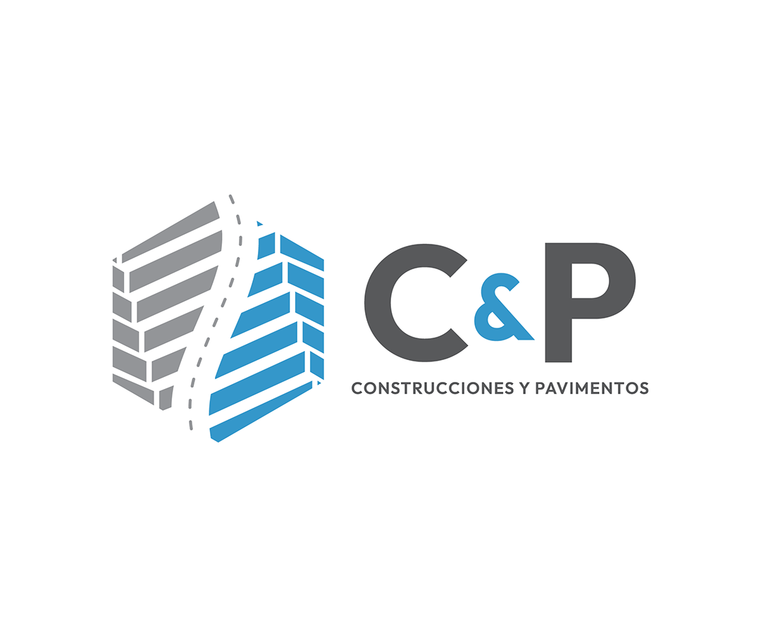
BRAND DESIGN : CONSTRUCCIONES & PAVIMIENTOS
Construcciones & Pavimentos approached our studio seeking a novel graphic identity alternative that would refresh their brand’s appearance, establishing a more personalized yet distinctive identity that reflected their new presence and approach in their industry.
INSPIRATION
Our objective was to visually represent the company’s primary service and product offerings while conveying a sense of security and reliability. The company’s name embodies the duality of its main product lines, which simultaneously balance and complement each other. We drew inspiration from the concept of balanced duality, encompassing the coexistence of these two elements to create a cohesive identity. This concept was further influenced by the principles of Yin-Yang, which represent the interplay of opposing forces.
UNIQUE PROPERTIES / PROJECT DESCRIPTION
Construcciones & Pavimentos’ new brand design incorporates several distinctive elements:
• A creative use of perspective and symmetry, with a dashed line separating the two sides, symbolizing transformation and duality.
• An isometric architectural style that evokes the image of construction and building elements, complemented by chevron-like patterns representing volumetric structures and pavement patterns representing the company’s activities and services.
OPERATION / FLOW / INTERACTION
The brand has been designed to be utilized in various formats, with multiple versions ensuring its adaptability across different mediums and applications.


MURALS : ILLUSTRATIONS
