
Alto Relieve is a young, innovative, social and environmentally conscious, architectural firm, and its here to stay. In a short time it has stablished it self within the industry, by consolidating and developing a string of successful projects throughout the country.
They were looking to create a new brand identity, that reflected their vision, values, and ethics; but they wanted it to be unique in its representation.
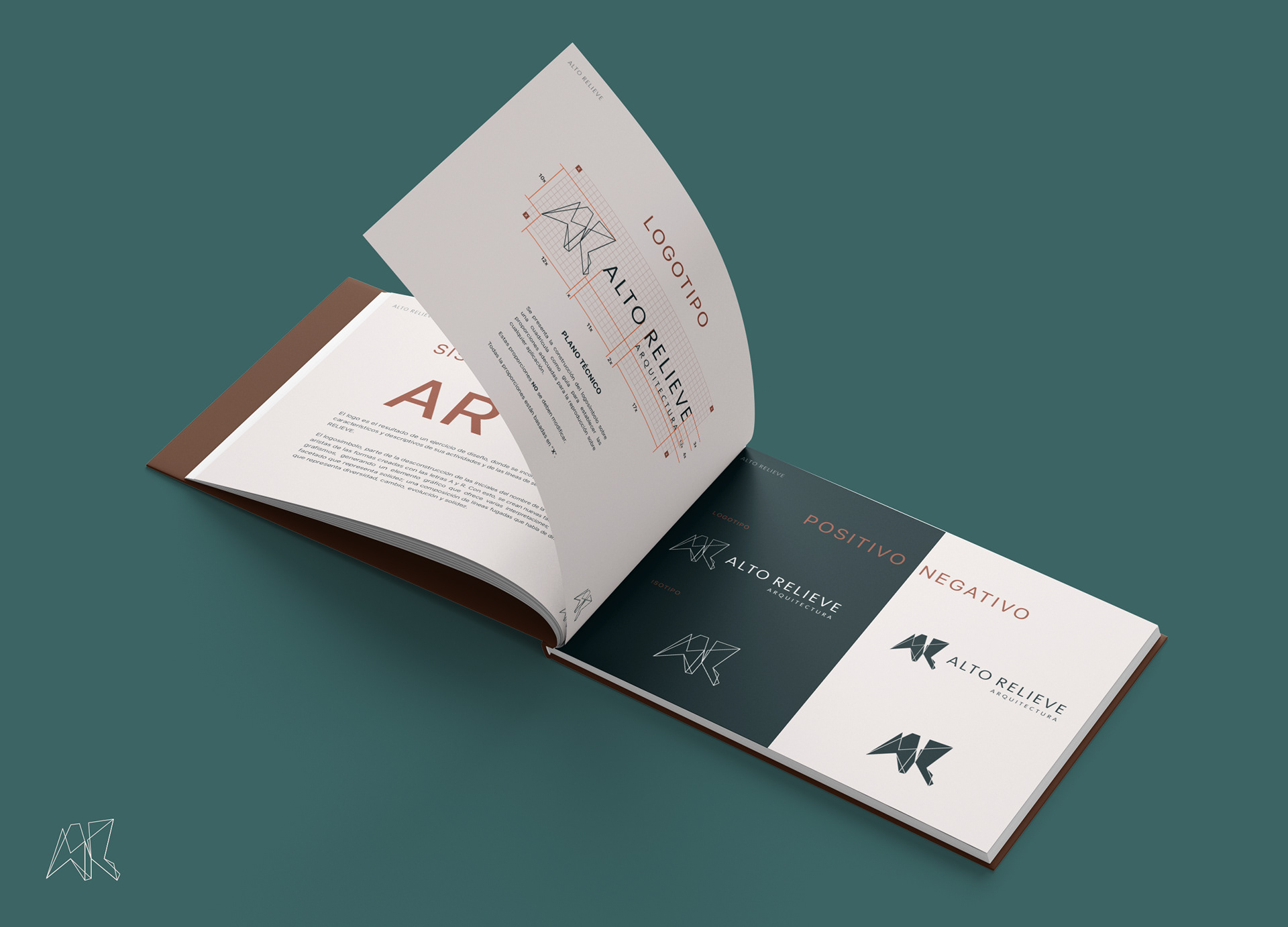
We made a conscious effort to create a brand that could resist the test of time, while at the same time, we wanted it to feel current. We strived to propose a new graphical language that would differ, from what is considered trendy, and ethereal; we wanted to build a brand that although young and dynamic, felt stablished and experienced.
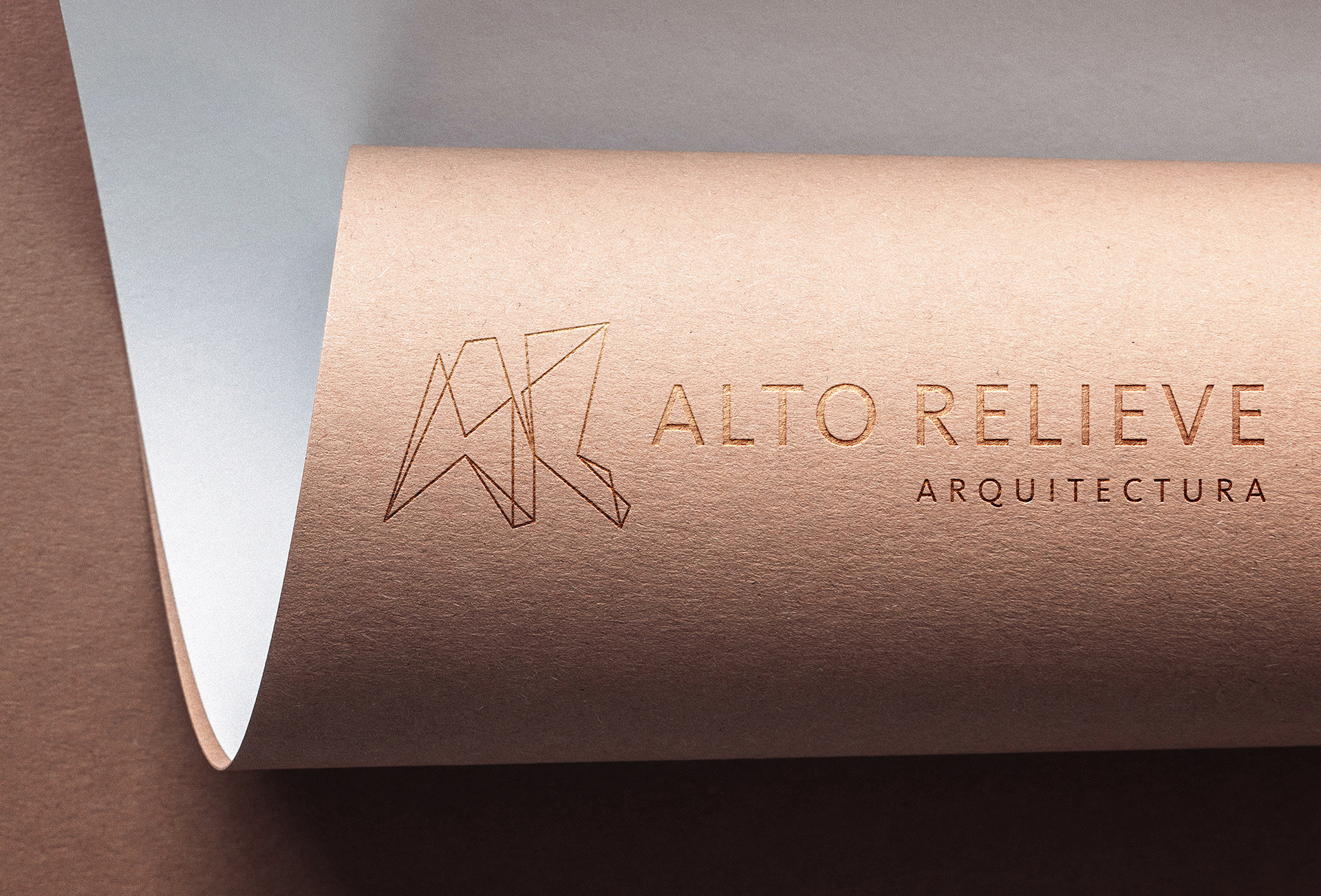
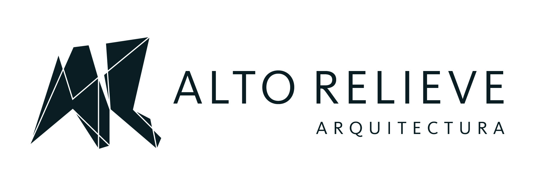
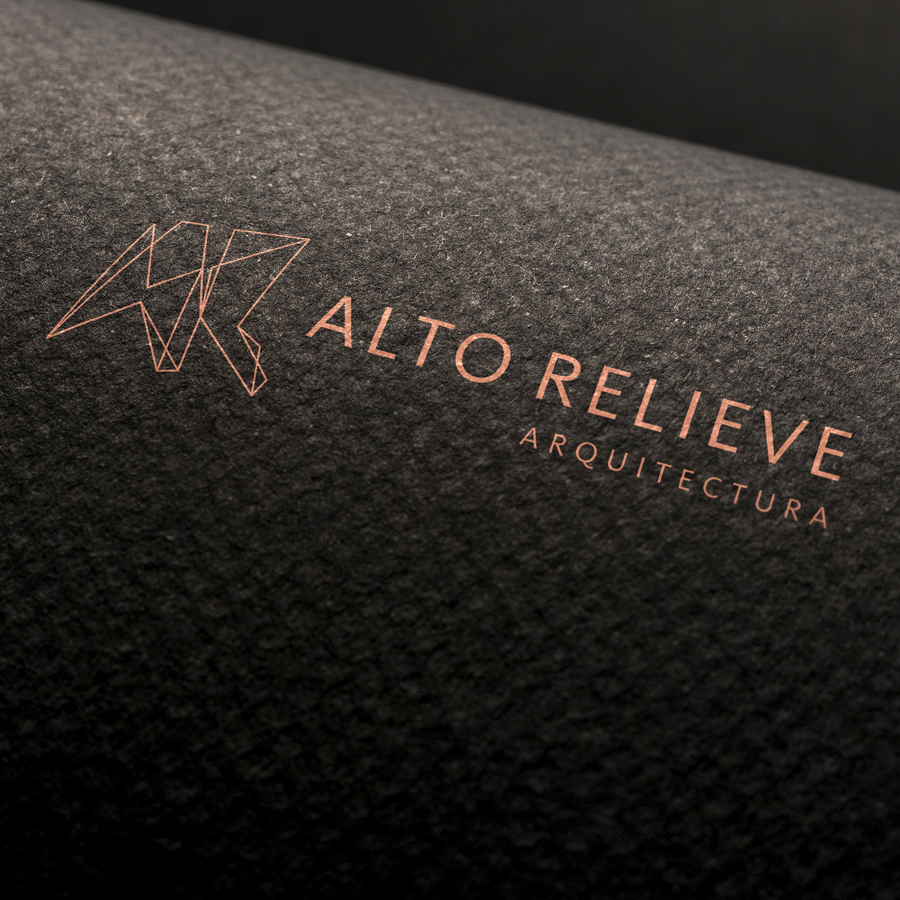
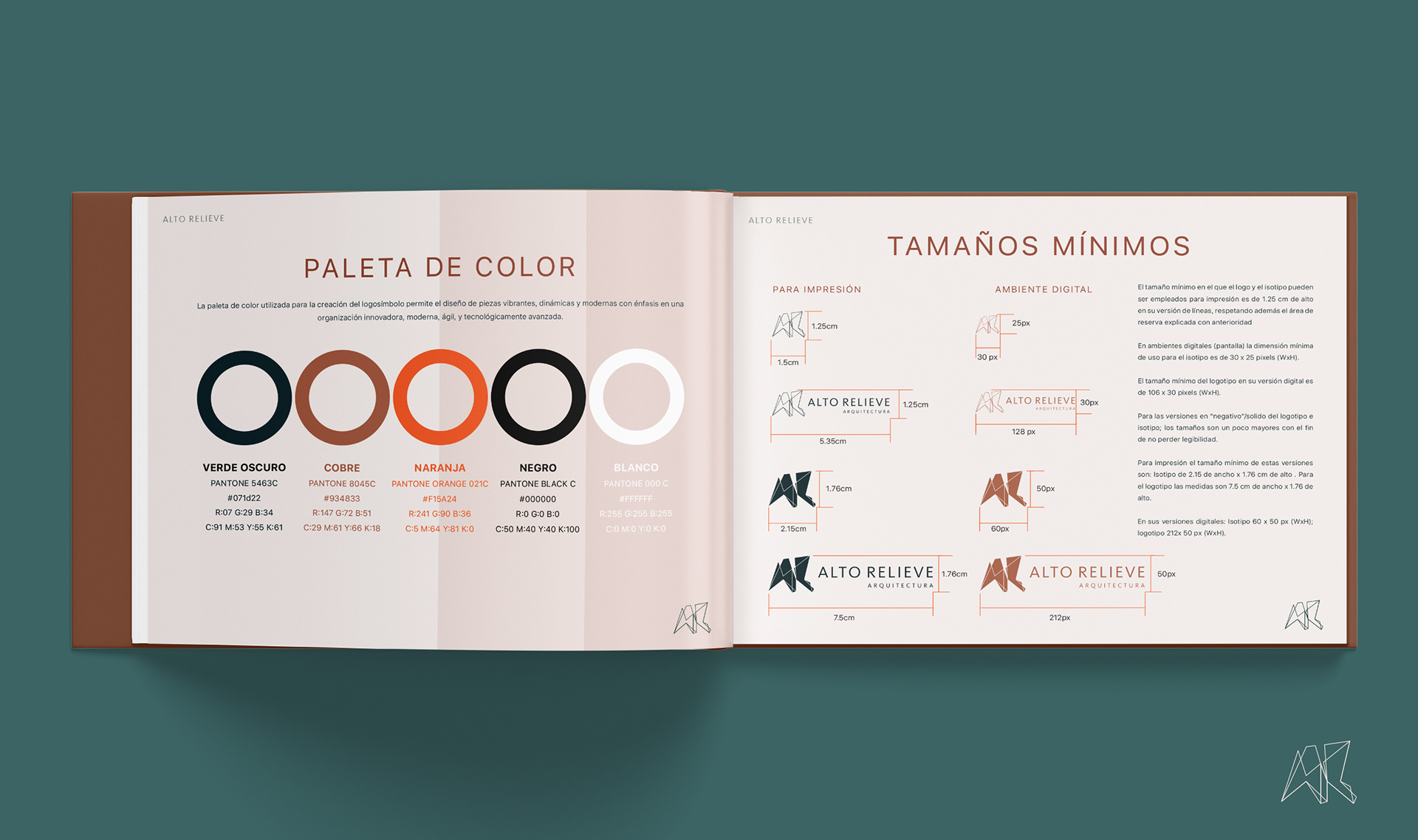
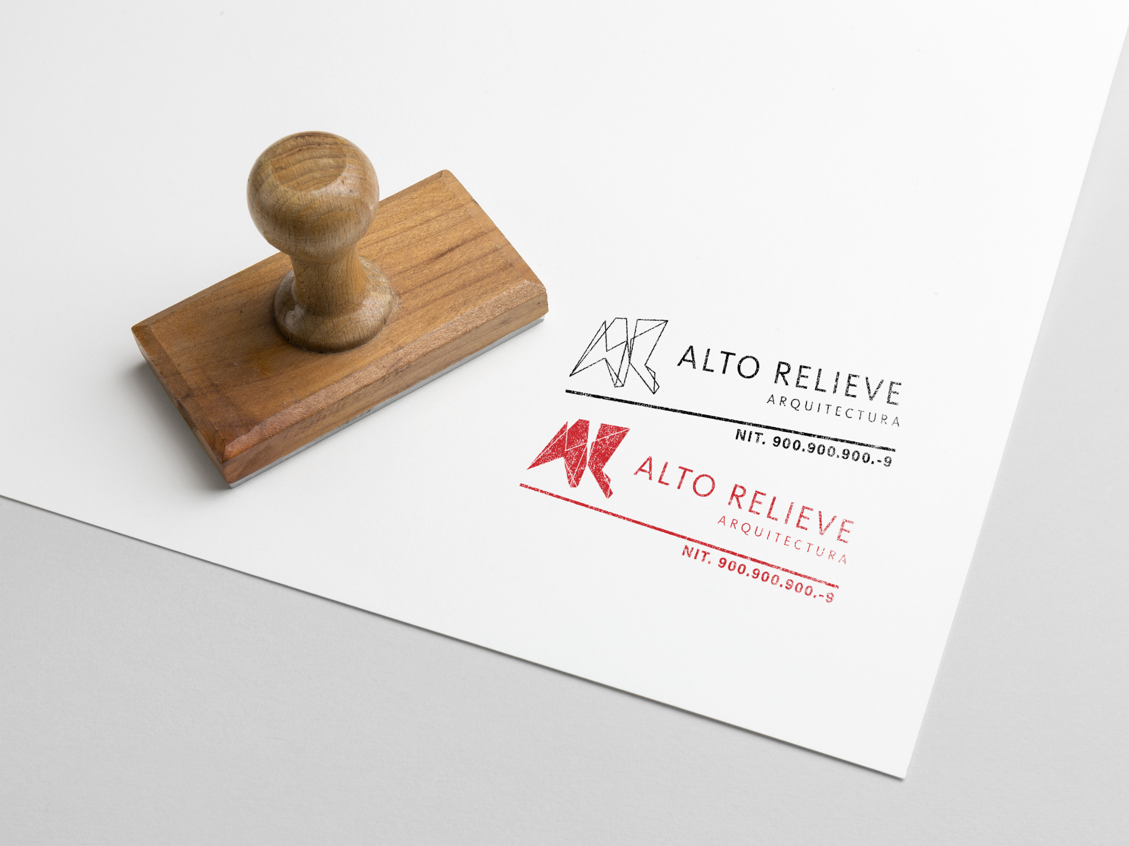
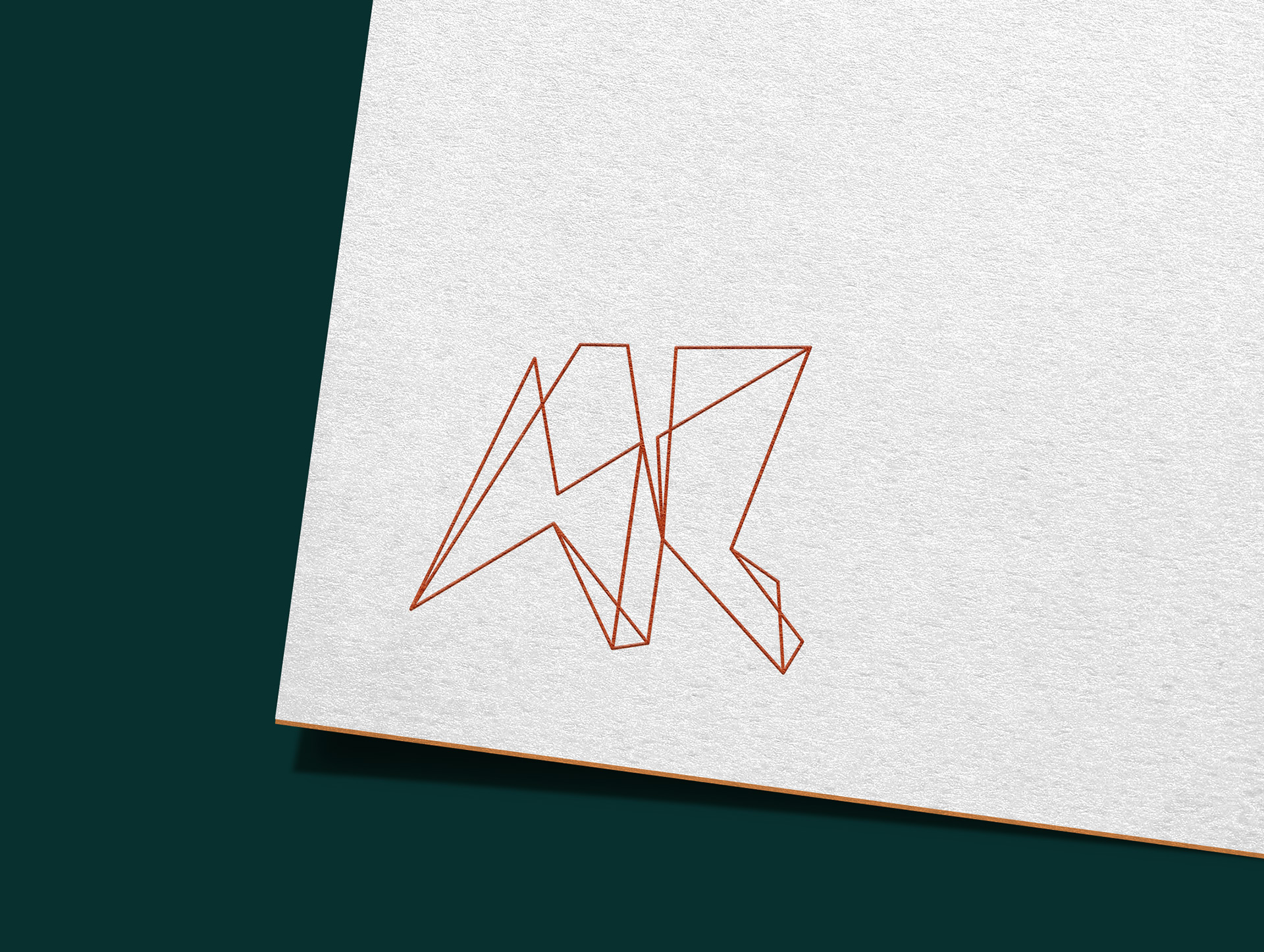
The resulting design is the transformation of the vertices and edges of the shapes created by the letters A and R, which generated a faceted monolithic polyhedron that represents solidity; a composition of lines that speaks of dynamism; a brand that represents diversity, change, evolution and trust-worthiness.
Thank you for visiting, please enjoy...